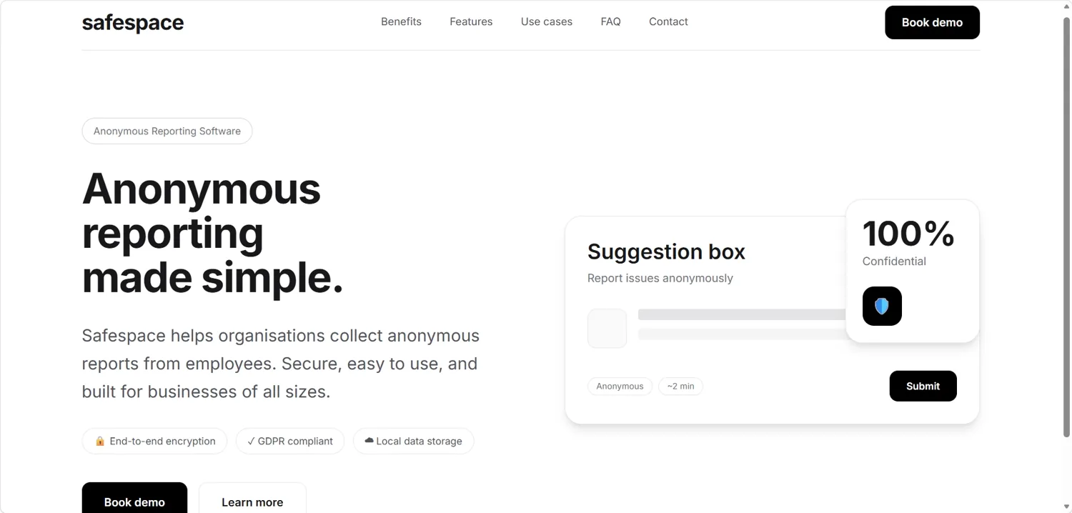
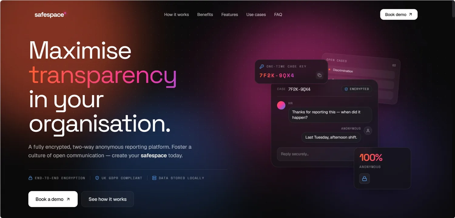
The same product, made obvious.
A redesign study: we took a live SaaS landing page and rebuilt it around a single job — make the value land in five seconds. Same product, same claims, different outcome.
- Type
- Redesign study — landing page rebuild
- Sector
- SaaS / software
- Scope
- Design, copy hierarchy, motion, build
- Stack
- Hand-coded — HTML, CSS, JS, deployed on Vercel
- Status
- Live rebuild, viewable below
Nothing wrong. Nothing landing.
The original page wasn’t broken — it just asked too much of the visitor. The value proposition sat below the fold, the hierarchy treated every message as equally important, and the path to signup competed with six other calls to action.
That is the most common state we find commercial pages in: not bad, just unfocused — and unfocused pages leak customers quietly.
One job per screen.
We rebuilt the page around a five-second read: who this is for, what it does, why to care — visible before a single scroll. Sharper type hierarchy, calmer motion that directs attention instead of competing for it, and one unmistakable path to signup.
Hierarchy first
One headline that says the thing, support copy that earns its place, and everything else demoted or cut.
Calmer motion
Motion used to guide the eye down the page — reveals and emphasis, not decoration. Fully respects reduced-motion.
A clear path
One primary call to action, repeated at the moments a visitor is ready — not six options fighting for the same click.